Spiezle Architectural Group
Branding, Page Speed Optimization, PPC, Responsive Website Design & Development, Web Design, Web Development, Website Redesign Services, WordPress Development / Architecture
Spiezle Architectural Group, Inc. is an award-winning architectural, landscape, and interior design firm founded in 1954. Spiezle architects build long-term value through innovative design solutions and make their clients’ daily lives easier. The firm has locations in multiple states and shows its entrepreneurial spirit by being 100% employee-owned.
Transformation
Objective
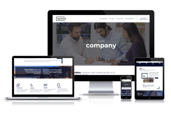
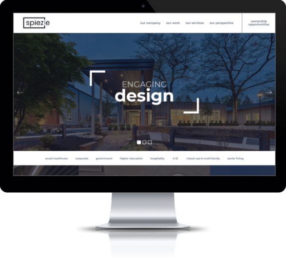
When you’re a design firm that has been serving and building communities for almost 70 years, it’s essential to have a website that reflects the company’s past, present, and future projects in a modern way. Spiezle Architectural Group has an extensive portfolio in the corporate, government, education, and healthcare sectors; however, the work needed to be presented with a fresh design to entice quality leads. The objective of the website redesign was to rebrand the company, make the bidding process more user-friendly, and showcase its employees’ passion for design and clients.
Approach
When website visitors seek out an architecture firm, they hope to learn more about the people, portfolio, and perspective.
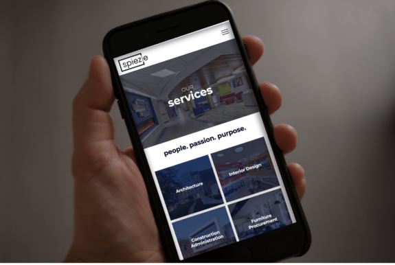
The first, most prominent section on the new Spiezle Architectural Group website designed by the Brandtenders at Lounge Lizard features “people” and the company’s “perspective.” Through this website design and new slogan (People, passion, purpose), Spiezle tells website visitors how committed every employee is to collaborating with clients to deliver the most innovative and value-driven project possible.
With architecture being all about design elements, the same goes for company websites. This starts with the logo and colors.
Our Brandtenders did a branding workshop, and all agreed that a simple box was no longer reflective of Spiezle. Our mood board also examined color theory and psychology to decide on the traditional yet modern use of navy blue, charcoal gray, and white throughout the company’s branding.
We took a very conceptual and meaningful approach to the logo design.
“Spiezle” is written in navy and gray inside a thick rectangle that represents its home. The “i” has a gray element, representing the individual approach Spiezle takes with every project. The “l” also is gray and breaks up the rectangle, acting as a door to the future.
The trend-forward logo combines traditionalism with a modern flair, paying homage to Spiezle’s history and its eyes on the horizon.
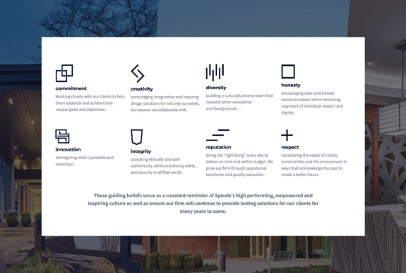
Elements from the logo are carried throughout the homepage, adding a trendy geometric flare while also being iconic and user-friendly.
How do you represent “reputation” in a creative, geometric, and out-of-the-box way for award-winning architects?
Our Brandtenders staggered three bold lines, signifying the building of the Spiezle’s character known throughout its industry.
It’s that level of detail and thought that builds incredible buildings … and websites.
Impact
Like a well-thought-out structure, the best websites impact the outside and the “inside” (the backend).
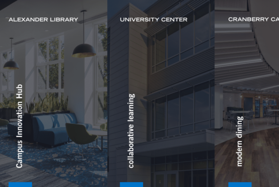
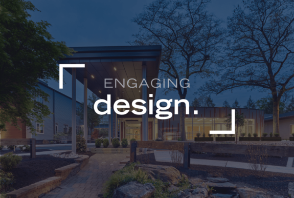
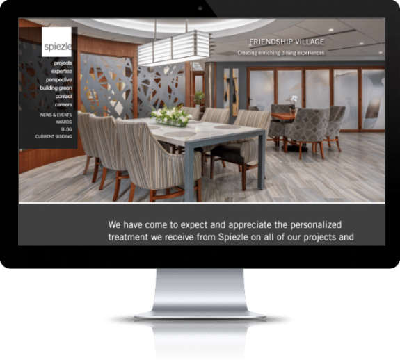
The well-organized and impressive gallery-esque portfolio of project photos keeps website visitors wanting more.
What do professionals do when they want more?
They bid.
The new and convenient bidding portal streamlines business, making the process less cumbersome and faster.
Website design, SEO, and branding are the stairs to Spiezle’s goals. With more organic traffic, longer times spent on the website, and SEO-optimized content, Spiezle is expected to see an increase in quality leads and brand recognition for years to come.
TAP INTO LOUNGE LIZARD
Lounge Lizard Brandtenders and Marketing Mixologists always serve up custom concoctions. We mix a potent combination of brand story telling with a generous splash of creative juices and blend in technology-focused, customized solutions as a chaser.
Related Projects
"*" indicates required fields
