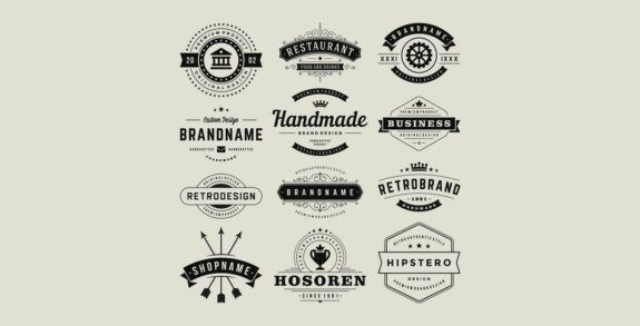
What your Logo says about your Website

What does your logo say? Is it an extension of your brand? When people land on your website and see that visual masterpiece of pixilation does it make them feel confident…or is it not credible and does it drive visitors away?
According to Google Adwords, 90 percent of visitors leave a site within 10 seconds if the design of the logo is not credible and doesn’t inspire trust.
Wow…that is a lot of people to be turned off by just your logo.
Perception is Reality
When people click on a website their eyes are taking it all in. You can have incredible content optimized with the perfect keywords, but does that matter if at first glance a person is not interested based on what many people think is a rather minor thing; the logo?
Perception in its’ first stages is always visual. We are a superficial race and we quickly judge everything, from people to situations, based on a quick first impression. Think about when you see someone for the first time. You quickly size them up based on the clothes they are wearing, style of hair and facial expression. If that person is snarling at you then you probably turn away. If that person is wearing a shirt with a crude slogan, perhaps you don’t want to make small talk with them. In any case, you make a quick judgment, categorize them, and move on.
The same thing happens when a person visits a website looking for something. More than likely they want information, a product, or a service from a trusted source.
Surface Credibility
The term surface credibility has been around for quite some time, but it hasn’t always been related to websites. It is a general concept that works with the idea of graphic design and the likability of a logo. As people have taken this concept to the web, the concept of logo design with surface credibility was developed.
Based on a study back in 2006 it was found that a credibility based logo design was up to four times more effective in influencing click-thru to a product or service purchase compared to those sites with a non-credible logo. As the internet has grown a lot sense then, that number shifted as well.
Credibility means how trustworthy something appears. Obviously people are more inclined to purchase items from a person or company they feel is reputable and honest. Surface credibility can be anything from how a product is packaged or how a person appears. In the case of a logo design, something that is poorly created or looks amateurish will have a low surface credibility. In a very crowded internet where people are worried about getting ripped off, the idea of credibility is very important.
Creating a Great Logo
So now the goal should be to develop a logo that has a good degree of credibility. You want something that symbolizes your business and shows that you are an expert or knowledgeable about that business. While there is not a specific blueprint, here are a few ideas to get you started:
- Design form – If you are an artistic business, then abstract is usable. For most businesses a contemporary style will be best because that will help focus on you being cutting edge, current, and up to date.
- Images – A good logo should describe visually what you do. A gym or fitness logo often incorporates a dumbbell to associate itself. There are exceptions like Apple, but if you have that great of a company then you aren’t reading this.
- Colors – There is a psychology behind colors (in fact we have written about it on this site). Understand what colors mean before you apply them to your logo.
- Text – Your name in a good font does wonder.
- Consistency – Extending the colors and style from your logo to the rest of the site gives a consistency that is perceived as professional and more credible.
- Focus groups – Create multiple options and then let public opinion tell you which one inspires the most trust.
People who don’t take the time to create a great logo and a credible landing page are truly missing out. It will cause people to leave after 10 seconds before they have had a chance to do anything. But the great thing about the web is that revisions can be done and changes made at any time. So take a good look at your landing page bounce rate and if it is higher than you think it should be, take a good look at your logo.


