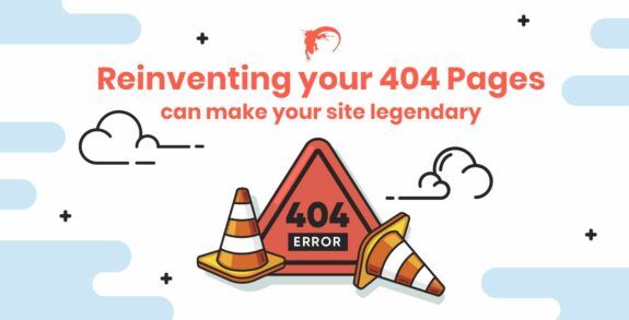
Reinventing your 404 Pages can make your site Legendary

One of the most common errors a website can experience is a 404 Error or a digital version of return-to-sender. When an invalid address is entered for an active page, a user is directed to a 404 Page to alert them of this problem. As a top web development company, we feel that 404 pages offer a unique opportunity to showcase a brand’s personality along with providing a higher level of user experience and increased customer satisfaction. This type of error is going to happen at some point but reinventing your 404 Pages can make your site legendary.
Why do these errors happen?
Shouldn’t a web developer do a good enough job that 404 Page Errors don’t occur? While in theory that is always the goal, the fact is that they will happen and for reasons that are sometimes out of the developer’s control. For example, if a user simply types the wrong URL in the browser there is no fault on the development end.
Broken links are another common cause of 404 Page Errors, and while in some cases this could be the fault of a web designer, it can also happen because of mishaps within the content management system by other employees. Products can be removed, content gets deleted, or there can be changes made to the permalink structure.
Ultimately, 404 Error Pages are a part of a website whether the business wishes them to be or not so the best approach is to maximize that page during the design and development process to create a positive user experience for a visitor that they tell other people about rather than creating a negative experience. With proper design and optimization, a lost visitor can be turned into a loyal customer.
Reinventing your 404 Pages
A default 404 page is about as exciting as a dentist’s waiting room. While functional in its’ purpose, it is often boring, bland, yet informative. A typical 404 page uses black text on a white page with a basic message of “The page cannot be found” followed by general reasons why and then options to go back or search the internet.
Wow.
Let’s review the checklist for this page. Is there any branding in places such as color scheme, fonts, or layout? No. Is there anything engaging about this page? No. Does the user feel as if this is possibly their fault or might be confused as to why they are on this page? Yes. Can this confusion cause frustration which increases bounce rates? Yes.
404 Error Pages should be:
- Branded – A user should never feel that they have left the business’s website, which can be the appearance when redirected to a default 404 Error Page. The best 404 Error Pages are all clearly branded so that users know where they are. The Lego toy website 404 Page uses a graphic of a Lego figure holding an unplugged socket for example.
- Engaging – Engagement is a critical aspect of every website and thus should be a focus for each page on the site. The 9gag 404 Page uses humor with a graphic to keep a user engaged along with a link to get people to where the business wants them to go.
- Useful – The page should still provide value to the user with navigation options and information. The 9gag page has a link to download their app, which is the entire focus of the website so most likely that is exactly what a user would want to do.
Ways to Elevate 404 Error Pages
- Craft clever or unique responses – Clever, fun, and interesting pages that stay on brand message and tone are often the best choice for a 404 page. Brands can also simply be polite and nice, apologizing for the error and providing navigation options for the user.
- Utilize humor – Humor is relatively universal when dealing with an awkward situation, which a 404-page error is. It can be awkward for the business if they made the mistake or the user who might feel as if they did something wrong. Humor is a useful bridge to overcome any negative feelings by making light of the entire situation.
- Create a game – By offering an interactive experience, a 404-page increase engagement with the site and brand. One UK-based site had a simple “Who should we fire?” game with pictures of employees who were being blamed for the 404-page error. After clicking on a picture, the visitor was sent to another page showing who was fired more often before providing additional navigation options to get the visitor back on track.
- Use topical messages – Taking the time to update 404-pages with topical or pop-culture references can be a good mix of both clever and fun if the references are understood and appreciated by your demographic. For those businesses using this style of page, regularly updating them is a necessity to ensure the message does not become out of touch as the references lose relevancy.
The Bottom Line
The bottom line is that 404-page errors are inevitable in the online world. Taking the time and energy to reinvent your 404 pages can make your site legendary as well as providing a better user experience for visitors, lessening frustration, and increasing conversions. With a really good 404-page, your site might even end up in articles such as this one which provide additional positive exposure and mentions for the brand.
Be sure to check back every week for great new Lounge Lizard blog articles.


