Top 5 Best & Worst Website Designs of 2021
Your website is the first impression someone has of your business, so it makes sense that you want to put your best foot forward. The sites that have made this list of the Top 5 Best & Worst Website Designs of 2021 show why well-planned design and a solid marketing strategy make a huge difference. What you’ll see here is that when it comes to website development, a truly awful site stands out just as much as an exceptionally well-designed one.
The main difference between the best website design and the worst is that when you’re captivated by a visually stunning site you want to take advantage of the wonderful user experience being provided — you want to follow the story. On poorly designed sites, your first reaction is often to bounce back to the search page looking for a better option or experience.
The worst website design is hardly ever done on purpose. More often it is a case of bad design element choices or just plain inexperience. Occasionally, a site is a victim of bad taste or humor that doesn’t “land”. Of course, that is one of the primary reasons why hiring a professional firm is so important because you simply don’t get a second chance to make a first impression.
5 Best Website Designs of 2021
Let’s start with some truly imaginative and inspiring website designs that give new meaning to the term “online experience”. These sites have several key design features in common:
• They are visually stunning
• They are mobile friendly and responsive
• They share a story
• They are interactive and engaging
1. Good Meat
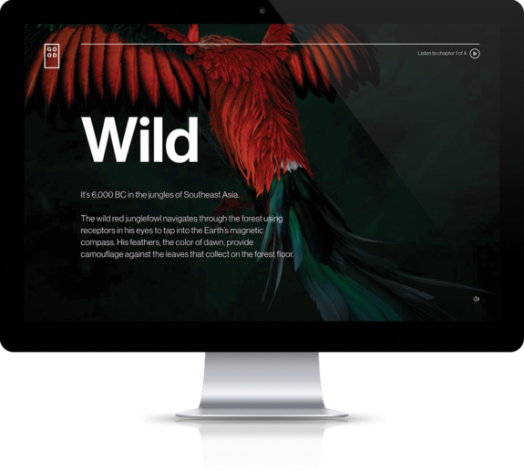
Landing on the site, you’re intrigued with the visuals — a sleek logo and simple hero heading on a muted almost mysterious backdrop of tropical feathers, and the beckoning “Click to discover” button that calls you to action. The website takes you on a journey through story, sound, and 3D visuals that is unexpected and deeply compelling.
Through the use of animated storytelling and a vibrant soundtrack, this precisely crafted website creates an immersive experience that’s compelling and memorable.
2. Patrappa the Trapper
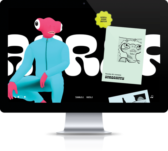
As a site to feature the work of an Italian comic writer, this website design works brilliantly. All in black and white, it’s a portfolio treatment but with an edge. Music, a day/night feature that changes the look and feel, and a body of work that keeps people engaged, this clean site offers easy navigation through a gallery portfolio of the artist’s adult comics and concept art. And it’s all set to a techno beat that’s reminiscent of 60’s rat pack chic.
3. The Neverlands
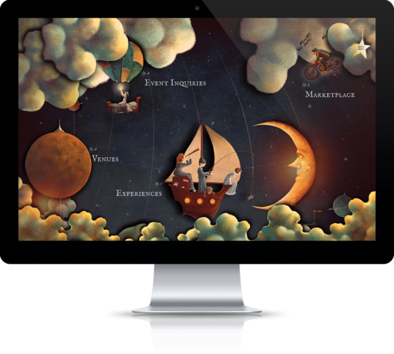
An LA-based nightlife and events venue, the Neverlands is in the business of experiences and their website reflects that through an extraordinary world of fantasy mixed with prohibition-era art and a touch of steampunk. With a curiosity-driven quality, this website interweaves custom animations with parallax effects taking the user on a magical journey of eccentric venues and unusual products in what is clearly one of the best web designs of 2021.
4. The Mill
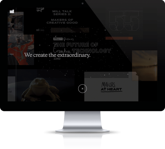
A visually arresting site developed for The Mill, a creative production studio based in London, New York, and LA, where you land on an “immersive tapestry” featuring their work on moving image, visual effects, and digital projects. The moving content can be explored by the user who controls how fast to scan, what to focus on, and where to explore in a tactile way. Uniquely, the site carries their calls to action on each page delivering the marketing message a precisely the best time.
5. Apple — AirPods Pro
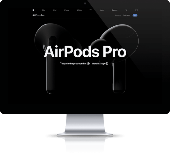
Creating an interactive and immersive digital ride, Apple’s AirPods Pro site uses 3D graphics and an interactivity that goes beyond scrolling and clicking. This technique transcends the typical ecommerce drawback of selling a product that you can’t touch or try out and creates a creative discovery experience that positively impacts sales.
Upon landing on the site, there is a crisp, clean black background and an image of the AirPods, but no indication of what to do. Intuitively, you scroll (as intended) entering a storytelling experience that packs a “Wow” punch that highlights the technology and the advanced features that make this product sought after by early adopters and regular users alike.
5 Worst Website Designs of 2021
Not that you’ve seen some of the best, here’s a look at some real standouts for ways to NOT design your website!
1. ARNGREN
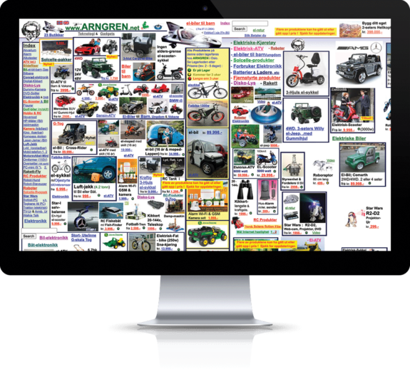
This Norwegian-based technology and gadget ecommerce site truly deserves to be on every list of worst website designs. Visually, it is totally overwhelming with products plastering every centimeter of the display. They offer the unique side-scrolling element which should never be used along with animated images that draw your eyes and distract customers. Navigation options are all over the place, plus the site isn’t responsive or mobile-friendly. And, last but certainly not least, Arngren don’t use HTTPS security protocols even though they are selling products and handling payment information for customers.
2. Pacific Northwest X-Ray
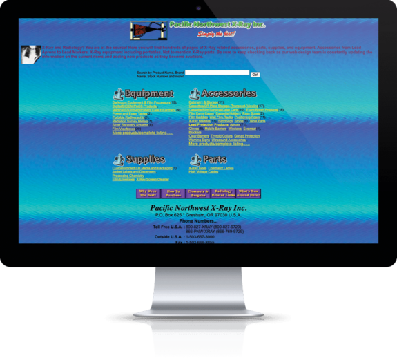
On this site, the color scheme, typography, and layout are straight out of the ’90s! While they claim to be “Simply the best!” at the top of the page, it’s hard to imagine any healthcare organization landing on this site and volunteering to do business. While the navigation is front and center, it is clustered and lacks any logical flow. The colors and lack of definition make it hard to focus on the important CTAs. This site also does not use HTTPS or any sort of mobile-friendly interface.
3. Mr Bottles
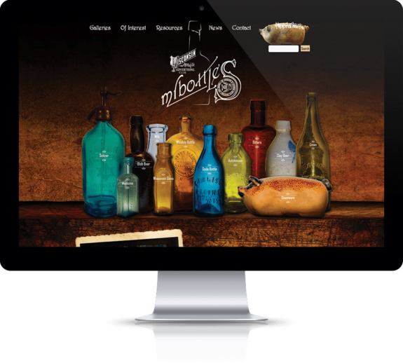
At first glance, this site seems reasonable and you might question why it is on the list of worst website designs. It loads quickly, and the landing page is interesting with the bottles sliding in. However, once you scroll down, there is no structure to the information and images being used and combined with the varying fonts, different colored text, and black background. Without a doubt, reading the information is difficult. Oddly with the focus on actual bottles, it takes multiple clicks just to view a subpar image when a well-designed image gallery with high-quality pictures would be a better option.
4. Suzanne Collins
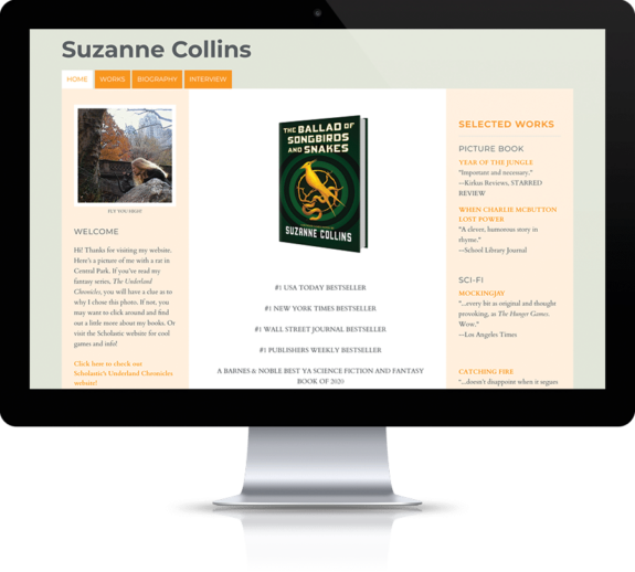
Looking at this site, it’s hard to believe that it belongs to the author of the Hunger Games book series, Suzanne Collins. You would expect something more interesting and exciting, but instead we get a bland site with a rather disjointed layout and no real central focus — it sort of meanders. Clicking on images does nothing even within the works section when they should direct you to a sales point. An author with over 100 million books sold deserves better.
5. 007.com
This is an interesting site which has been featured on bad design lists before. Apparently, the purveyors of 007.com did listen because they recently performed an overhaul making the site much better. However, it still makes the list because 007 deserves something “shaken, not stirred”. While the appearance is much better with the use of white space and separation around elements, there ends up being too much white space and the fonts are inconsistently used. The use of tiles as an element is a bit jarring as the sizing and placement is inconsistent which draws the eyes all over the screen.

Elements of Good and Bad Website Design
By looking at these examples of both good and bad websites, we can learn quite a few things to incorporate so your website ends up on the right design list:
• Pages should be clean and well-defined adding interest instead of detracting
• Intuitive, easy to find navigation is important to the user experience
• Mobile friendliness is key in 2021 and beyond as search engines shift their focus toward smartphone devices
• CTA’s, or calls-to-action, should be easily identifiable and guide users to take the next step of your marketing sales funnel
• A clean, visually appealing layout and interface is easier for users to digest
• Fonts should be applied consistently without using multiple types, sizes, and colors
• Every site should have a purpose and tell a story; the design should flow around that purpose and story
• Provide thoughtful and interesting content to rank well in search engines
• Use adequate security protocols to ensure customer financial information
The Bottom Line
The bottom line is that your website is often the first point of contact between your business and new customers. What type of message are you trying to send them? This list of the Top 5 Best & Worst Website Designs of 2021 is a good reminder of things to avoid unless you like low conversions and the notoriety of ending up in an article like this.
If your business is looking for website design services, contact one of Lounge Lizard’s Brandtenders to evaluate your website, request a proposal, or talk about possible changes in 2021.
Be sure to check back every week for great new Lounge Lizard blog articles.
