Inspired Website Design — Best of 2022 (So Far)
Coming out of the pandemic, we find that many companies used the time to upgrade their websites and overall brands. It seems website design and development companies were working double time to keep up with the demand.
While many creatives were working remotely, the end result was some inspired website design ideas that have energized the overall marketplace. From new and interesting 3D elements to fantastic user onboarding experiences, websites have never been more interesting and engaging.
Let’s take a look at some of the best websites for web design inspiration.
Website Designs that Inspire
What is inspiration? In its most pure form, inspiration is a flash of insight, creativity, and brilliance. Its imagination, innovation, and originality all rolled together!
In website design and development, inspiration leads to user experiences that are captivating, informative in an engaging way, and that lead the customer through the sales funnel culminating in the desired outcome — a sale, a lead, a trip to the local movie theater.
These websites do that in striking new ways — let’s take a look:
Welcome to the ‘House of Gucci’
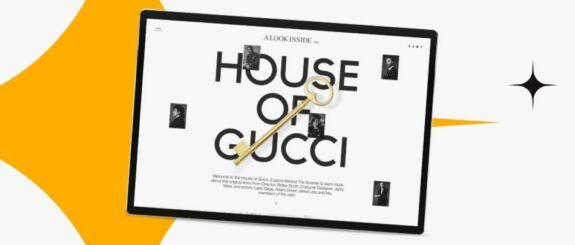
As movie websites continue to morph into their own sub-specialty, this website for ‘House of Gucci’ is a standout. It was developed as the marketing partner to the movie starring Lady Gaga, Adam Driver, Jared Leto, and Al Pacino.
With that much star power, the website had to be cutting edge and it opens with a dynamic animation in crisp black and white that flows as you scroll. The only color is from the golden key that floats in the center of the screen as it twists and turns while scrolling – equally affecting on mobile and desktop.
The overall animation is exceeding fluid which captures users and leads them through the story of how the movie was made from the director, the actors’ reminiscences, and even the costume designer’s thought process in designing the award-winning costumes.
This thoroughly engaging site features a unique flyout menu that introduces a new treatment for navigation menus, as well as the strong use of typefaces through a mix of Serif and Sans Serif fonts.
Uplinq
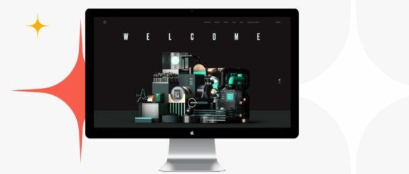
Uplinq has created a technology-based company website that does an amazing job of presenting bookkeeping and accounting services in a new, updated, and exciting way.
Their home page is a brilliant custom 3D animation that gives the illusion of changing robotic equipment while the screen stays still. As the user scrolls, the animation and messaging changes, but the user doesn’t have the feeling of moving down the page. The state of the art animation leaves no question that Uplinq is offering a highly technical product.
Additionally, the color palette is black with teal and gray (which is perfectly suited for the industry), and they introduce some inventive navigational tools that are real standouts. There is also imaginative and unique typography use that matches the look and feel of the site and conveys their brand perfectly.
Moheim
As a minimalist home décor ecommerce store, Moheim.com is a triumph!
While clean, minimalist website design in not really new, the way it’s treated on this website truly creates a calming and soothing environment. The color palette (and the color and design of their products) is ultra-contemporary and feels very organic. Plus, the minimalist typography treatments really focus the user’s attention on the various products.
Their website developers ensured a buttery smooth animation that flows rather than starts and stops suddenly like so many sites today. And they also perfected a nice acceleration and deceleration that’s based on the user’s scroll speed to great effect.
Frantoio Cavalli
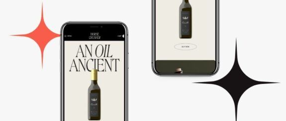
This luxury food brand from Italy has done a gorgeous job of creating a website that conveys ‘old world’ charm with a Tuscan vibe to market their exclusive olive oils and sauces.
From the home page opening animation, which includes an olive press and granite horse statues, on down the page introducing their products, subtle illustrations and animation add interest and further conveys the story of the family and their history.
The liberal use of a Serif type adds flair and imparts a European look that is carried through their product listings, as well as their resources and recipes. The site gives the feeling that they sell only the most luxurious extra virgin olive oil available on the market and you have an exclusive ability to purchase some yourself. Expert marketing!
Blok Watches
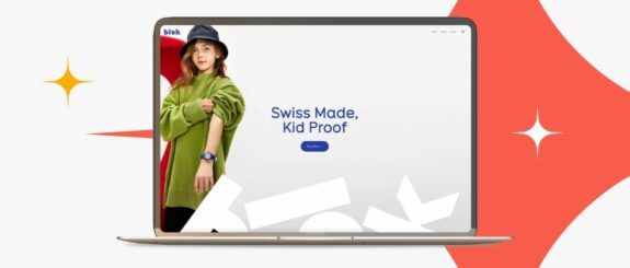
A new watchmaker, Blok Watches specializes in analog timepieces for kids and their website imparts a fun, colorful, imaginative way of looking at the world. The user is led to a creative parallax animation and video where bright animation explains their product (and its unique features) in simple, understandable terms.
Using bold colors and shapes, clean block type, and creative animation, this site uses detailed high res imagery to great effect. Who would have thought that analog watches would make such great fashion statements for the skateboard set!?!?
Door Dash – One Dash Closer
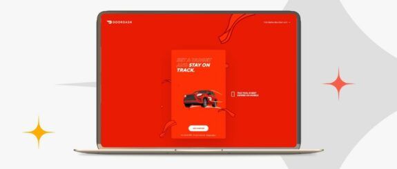
Door Dash is not only the top food delivery company in the country, but they also have a website/app devoted to helping their ‘door dashers’ keep track of their personal goals and achievements. This site is a companion to their Door Dash for Dashers site where people sign up to drive and deliver, schedule/accept jobs, and get paid.
The One Dash Closer site has a colorful, bright look, plus incredible custom animation. The user onboarding is straightforward and explains itself thoughtfully. And there is a helpful progress bar that let’s users know where they are in the process when signing up.
Door Dash seems to have a pulse on their ‘door dashers’ and wants to support them in achieving their goals, whether that’s saving for a big vacation, paying off bills, or buying a new car. This site was thoughtfully designed to be engaging and friendly while helping them achieve their own personal benchmarks.
My Seoul Box
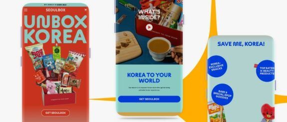
As subscription boxes have grown in popularity, as well as all things Korean, My Seoul Box created this website to capture the pre-teen crowd that loves K-Pop and BTS, EXO, and BlackPink!
Through the use of clever product presentation, bright colorful imagery, and funky type, the My Seoul Box website has created a user experience that’s sure to delight people of all ages.
The innovative website also demonstrates a subtle use of parallax movement as you navigate down the pages which is eye-catching and further tells the story of their authentic Korean snacks and merchandise. With this customer-facing experience, expect to see these subscription boxes on all the ‘best of’ lists this year.
Bakasable
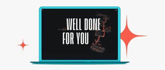
A French technology company specializing in mobile and web application development and digital design, Bakasable’s site demonstrates great storytelling through the use of scroll-based animations creatively presented on a black background with a single color palette.
The hero image/animation captures the user’s attention and engages them immediately in the story being told.
From there, you continue along the journey and are treated to interesting hover effects over the text that changes from section to section.
When you arrive at the services listing on the home page, there is a mix of black and white photo images and images overlaid with the color from the hero section (when hovering) that stay visible as you open each one (no matter the order) creating a stunning effect.
Likely Story
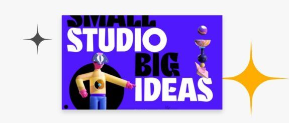
Out of the UK, Likely Story is an award-winning boutique design studio with a big bold website. This site uses striking, large type face with bright colors and showy, vivid animations that highlight their quirky style and creative work.
Their design reel video has assembled some of their award-winning work and highlighted it in a short montage of flashy shots designed to give you a snapshot of their breadth of work, their design aesthetic, and their wide range of projects — an attention-getter for sure.
The website uses 3D elements throughout to great effect and adds a changing cursor to further engage the user. Their animated figures really imbue a personality and match with their bios to give the users a sense of the principals.
The subpages each have a unique parallax animation, with the Work page having one of the most creative cursor treatments in recent memory. The hover effects and navigation are utterly unique and convey the company’s fresh, innovative style.
Final Word
So, now we’ve looked at some extraordinary examples of the best websites for web design inspiration.
They use everything in the website design and marketing arsenal, from color palette inspiration to 3D elements and custom illustrations.
However, there is one common thread through all of these sites — great storytelling. These are top website designs that do an excellent job of communicating the company’s message to their potential customers and they do it in a memorable way that creates an overall experience for the visitor.
When you are considering a new website or a refresh, think of these inspired website design examples and go big!
Contact Lounge Lizard to learn more about best website design inspiration and how it can improve your site visibility and customer experience. We have an extraordinary digital design and development team along with industry-leading SEO and marketing services.
