Top 5 Best & Worst Website Designs of 2022
Each year, website designs change, and different trends rise to the top. Join us on a journey while we take a look at the best and worst website designs for 2022.
There are 133,361,676 websites in the US with over 252,000 new websites created every day worldwide — or three every second.
So how do you create a website that stands out and captures people’s attention?
Hear from Ken Braun, Lounge Lizard Worldwide Founder and Webby Awards judge, in our video below as he discusses the top 5 best website designs of 2022.
What Makes a Great Web Design?
Basically, there are five key elements of design that ensure your website will attract users, keep them on your page, and lead them to the conversion point, be that a sale, an email capture, or some other lead generation. Consider these five things when designing a website:
- Usability — Websites need to offer a great User experience (UX) and they need to be functional with intuitive and interactive interfaces (UI).
- Aesthetics — Websites should have a crisp, cohesive, and pleasing design and color palette. You can go in different directions with modern or minimalist or funky designs, but the overall look should be attractive. What you don’t want is the visual equivalent of ‘nails on a chalkboard.’
- Navigation and Flow — Websites can have typical or traditional navigation or ultra-complex navigation, but if it doesn’t lead the user through the sales funnel to the desired end result, it isn’t doing its job.
- Fast Load Time — Mobile responsiveness and fast loading are critical to website success and even the most elaborate designs need to be optimized to meet Google requirements, including the Core Web Vitals.
- The WOW Factor — It’s hard to put a specific description of what creates the WOW Factor. Sometimes, it’s super technical. Sometimes, it’s explosive. Sometimes, it’s subtle. All we know for sure is you know it when you see it!
What Gets the Best Websites Seen?
Once you have a well-designed website you need to have a strong SEO strategy that ensures your website ranks high on the Google Search Engine Results Pages (SERPs). On-page, Off-page, and Technical SEO work in collaboration to ensure a website is seen by Google as having authority and offering industry guidance and helpful information to their client, the user.
So, without further discussion, let’s get started on our journey to see the top 5 best and worst website designs for 2022.
5 Best Website Designs for 2022
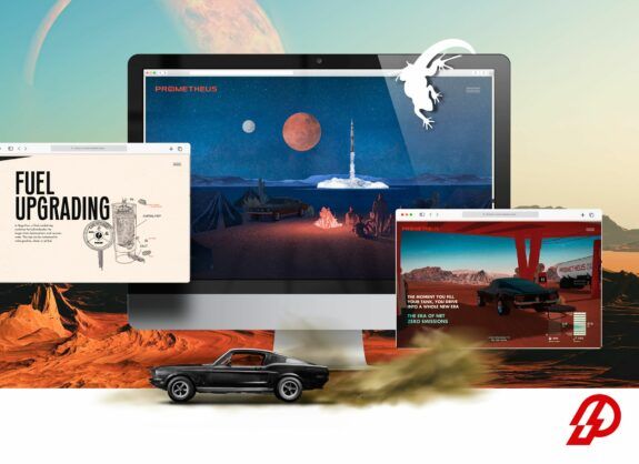
Prometheus Fuels
Wow! What a start to the list. Prometheus Fuels’ website creates a totally immersive experience that’s very original and literally draws you in to their mission.
From the first Hero section, you are engaged in an interactive story that leads you through their goals and technology while you feel like you are on a high speed journey. The navigation is extraordinarily original with animated effects that capture the user’s imagination and lead them to the next chapter.
This new site gets a standing ovation on originality and creativity and the designers get kudos for an impressive job.
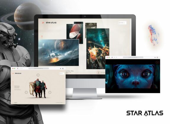
Star Atlas
Welcome to the MetaVerse! Billing itself as a ’Grand Strategy Game’, Star Atlas’ website lives up to the trailer’s overall look and feel, while being hugely engaging and immersive. The site also does a good job of explaining what you can expect when you step into this MetaVerse game.
From the moment you ‘Click to Enter,’ you are taken on a wild navigation that takes you on a journey told in six chapters through what looks like the art direction drawings for the game itself. Along the way, there are portals that give you more context and visual cues, plus introduce the game, the mission, characters, spacecraft, and concepts all to encourage you to play the game.
The website designers and developers have done a terrific job with the website and are creating a MetaVerse game that doesn’t look like puzzle pieces, but instead, a sophisticated video game.
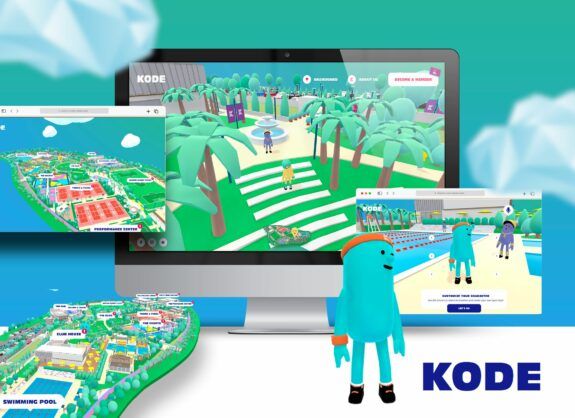
Kode Clubs
Another entry in the MetaVerse category, Kode Clubs lets you try out their 3D virtual MetaVerse sporting environment. You travel on a journey through an interactive cartoon with a metaverse look to get information about their different sporting facilities, click on objects, and collect points.
While you may or may not want to ‘join the club,’ this is a great use of interactive design, color, and engagement. Take a look.
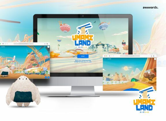
Umami Land
Umami – the fifth taste – the taste of savory steak, rich sautéed mushrooms, or Parmigiano cheese sprinkled on, well, anything. It’s also a huge part of Japanese cuisine, so Google created Umami Land (part of their ‘With Google’ sandbox) as on online theme park totally focused on Japanese foods.
And this isn’t just sushi and pot stickers. There are tons of interesting foods like Hiyayakko, a smooth, chilled tofu side dish, and Kakigoori, shaved ice confections. All meticulously created in brilliant color with tons of interactive buttons and movement.
Sounds crazy, but the site is fun to explore. It’s a virtual food trip that has interactive icons that appear where you can get additional information about certain Japanese foods, plus find out where you can try them close by your location. Each food can be linked to a local search of restaurants in your area that carry the dish on their menu.
In fact, Google won awwwards.com Site of the Month in February, 2021.
Bon Appetit!
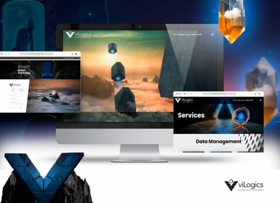
viLogics
Full disclosure: This site was created by Lounge Lizard, but trust us, when you take a look, you’ll see why we’re so proud of the final design and build.
The company, viLogics, sells cybersecurity solutions for IT networks and infrastructure. Taking the lead from futuristic cinema in the vein of Bladerunner and Star Wars, we used a fortress concept that cohesively carries throughout the site. From the initial rendering, sections of a space age fortress floats through clouds to come together in a massive fortress on top of a mountain range.
From there each page and service flows from the initial design to create another component of the whole — multiple layers of the fortress. As creative websites go, this one is amazing, and we think a good representative of the WOW Factor.
Our Choices for Worst Websites and How They Missed the Mark?
We’ve covered some award winning websites and top website designs, now let’s take a look at five sites that just don’t quite make the grade.
5 Worst Website Designs for 2022
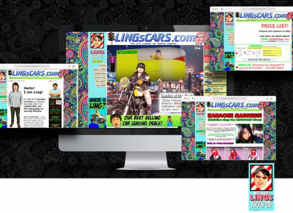
Ling’s Cars
Wow! There is a lot going on here. This site may need a warning for seizure-inducing flashing lights!
Simply put – there is just too much going on. And it doesn’t get any better as you scroll down the page or switch to the mobile site. Even the paisley pattern on the sides seems to add to the frenetic quality of the user experience.
It seems to be quite intentional, but for our money — less is definitely more when it comes to the best website designs.
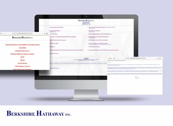
Berkshire Hathaway, Inc.
Their official home page is an homage to years gone by — more specifically the early years of the internet (like 1990). It’s a single page with a list of links to various corporate releases, many required by law and the SEC since Berkshire Hathaway is a publicly traded multi-national conglomerate (their words).
From the look of their website, it’s hard to believe that Berkshire’s current market cap is over $610 Billion, and they own major shares of companies like GEICO, Coca Cola, and Wells Fargo (to name just a few).
While Warren Buffet has made a reputation on frugality, we think this company would benefit from a state of the art website worthy of their stature.
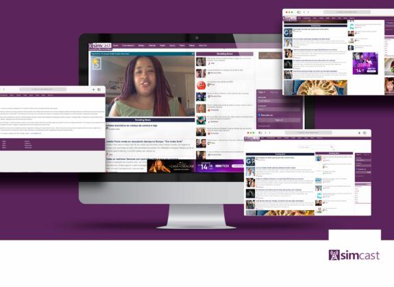
SimCast
SimCast is an aggregating news site that lacks any sort of organization or UX design. It is simply two columns, one for trending news and one for breaking news. You can select a category if you want to filter your news selections, but we doubt visitors get that far.
News websites can often be cluttered and without clear editorial focus, but SimCast seems to just function as an aggregator streaming news for its clients with no obvious sort of monetization.
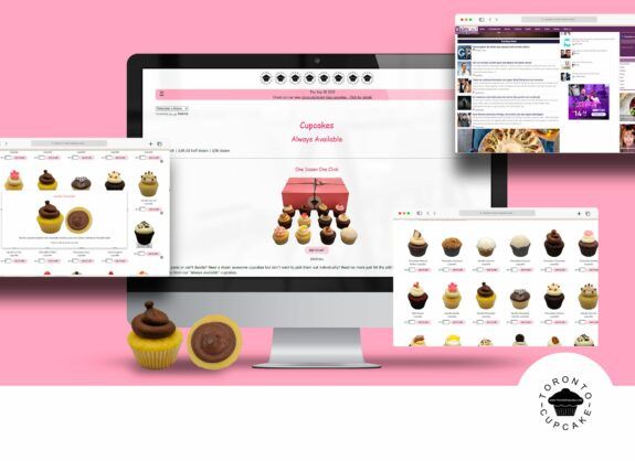
Toronto Cupcake
This website makes our list due to its overly simple design. The hamburger-style menu is easy to miss and there is minimal design or color, relying instead on a simple white background with pink accents.
When your business is sweet treats, it pays to have bright colors and fun, decorative pages showing off your products. A better example of a stunning website would be Dylan’s Candy Bar in Manhattan.
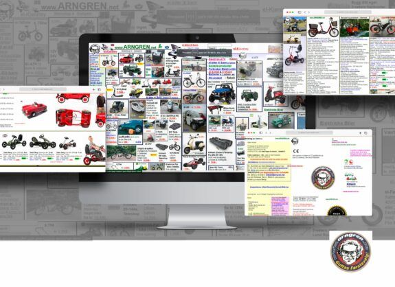
Arngren.net
And we saved the best for last. Arngren.net makes the list every year as the perfect example of what not to do. While the site is located in Norway, the translation works perfectly so you can always read the text.
The problem is you can’t narrow down the products. The offerings cover everything from breathalyzers to air jacks to rocket aircraft (and not in alphabetical order).
One thing we will say, they are tenacious. The site never changes, and they never take down the Christmas holly on the masthead. Cheers to Arngren! They are sticking with their formula, so it must be working?!?!?
Timeless Elements for a Great Website
We’ve looked at the best and the worst for 2022.
If your website would benefit from a review or you want to spruce it up to compete with some of the best websites, consider Lounge Lizard, a Digital Design & Marketing Agency. We have an expert team of designers and developers with great ideas for timeless and effective websites. Please take a look at some of our work here.
Contact Lounge Lizard to learn more about digital design, SEO, and social media marketing.

